Living Room Winter Makeover

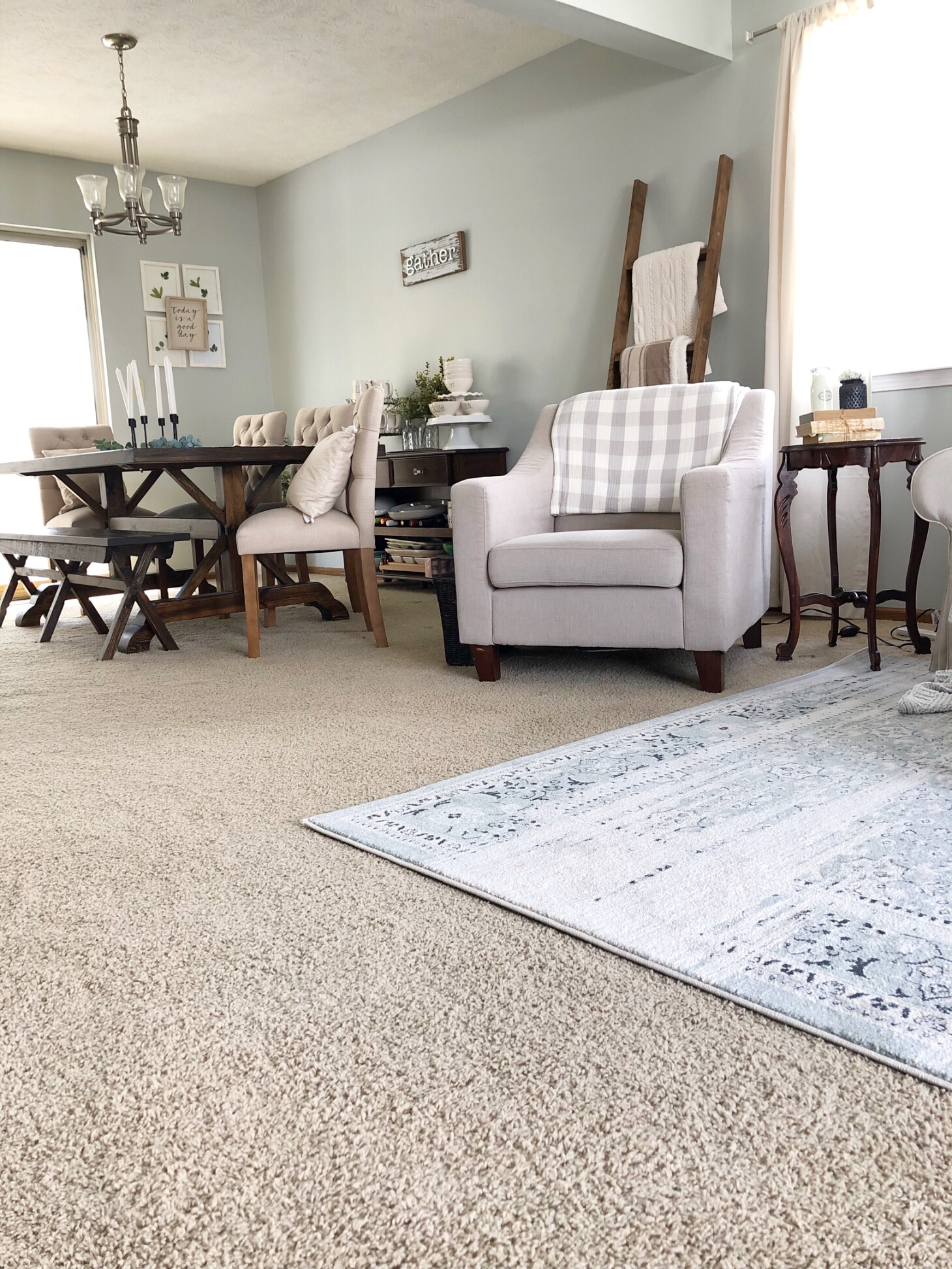
I'm so excited to finally share our living room makeover! I mentioned previously that we were doing a small refresh to our living room, with a new couch and rug, and I'm finally finished!

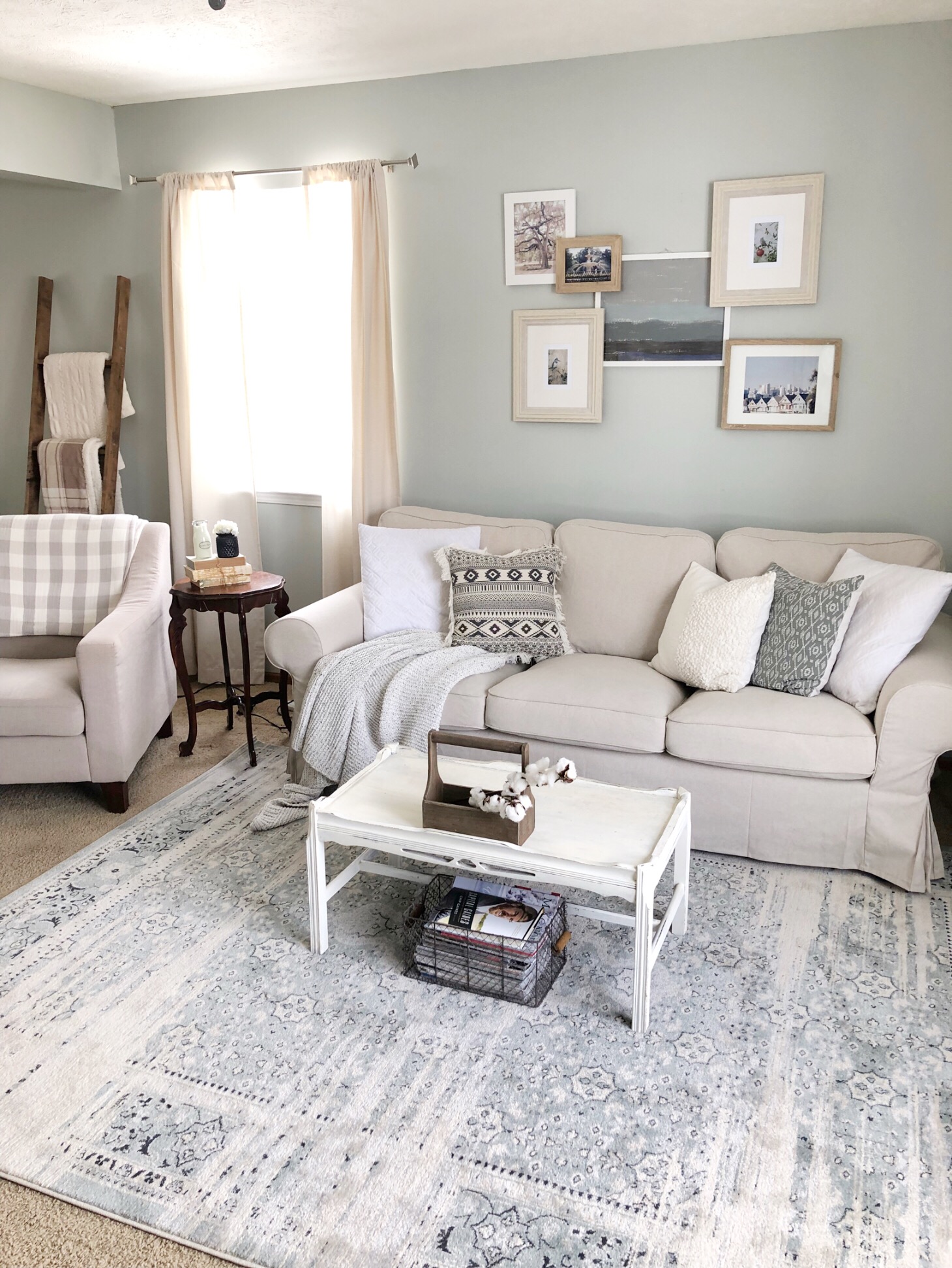
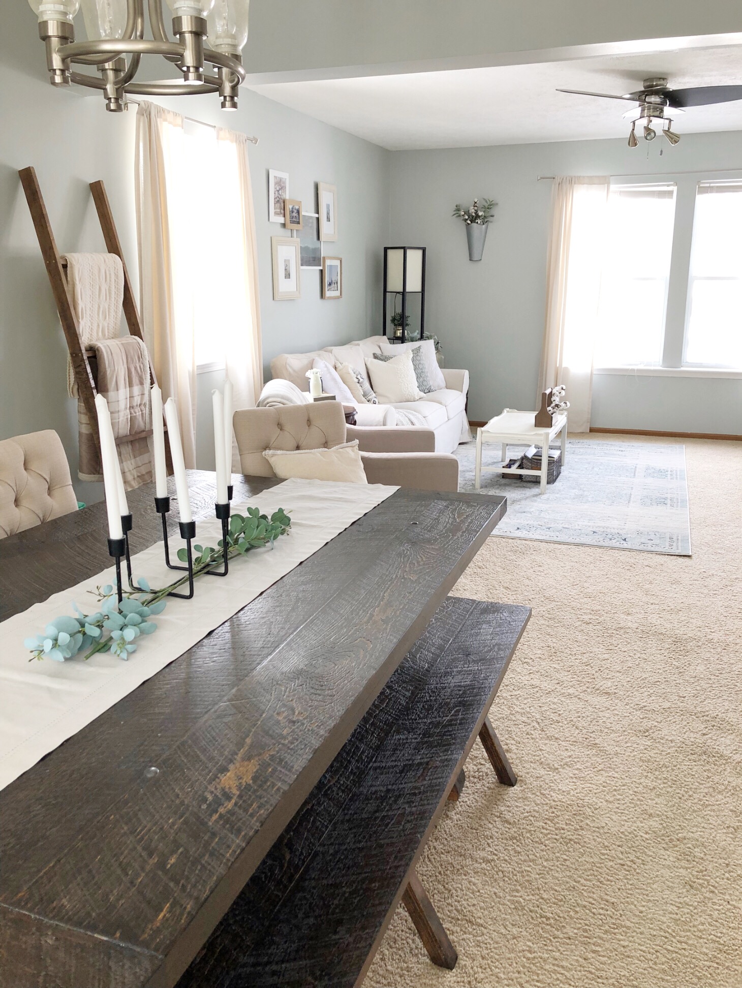
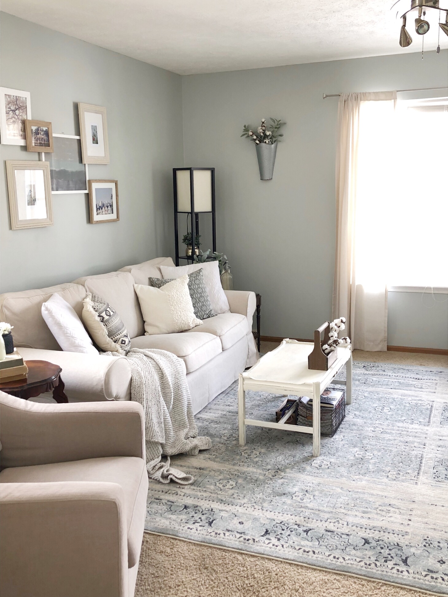
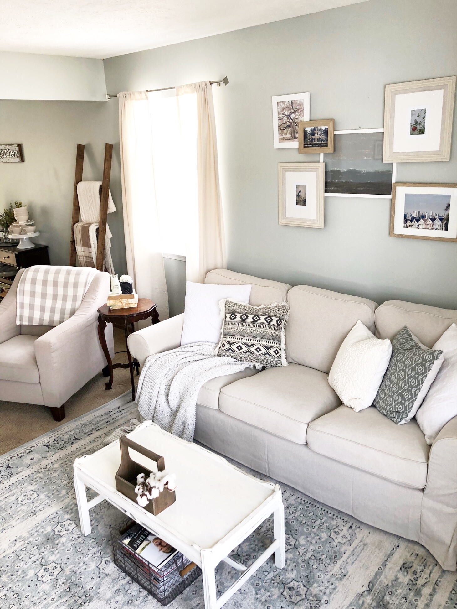
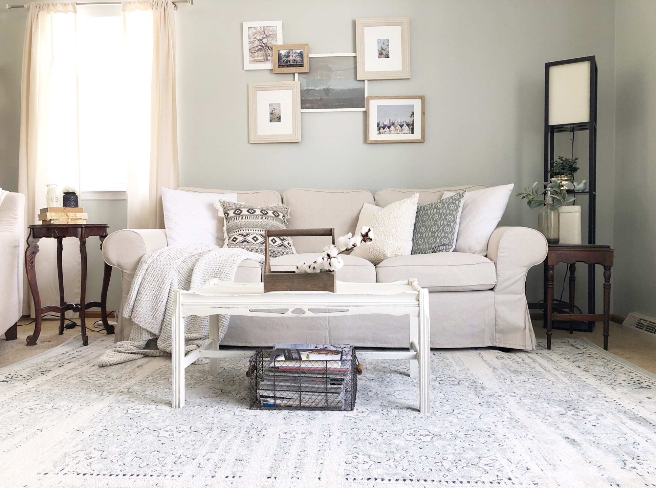
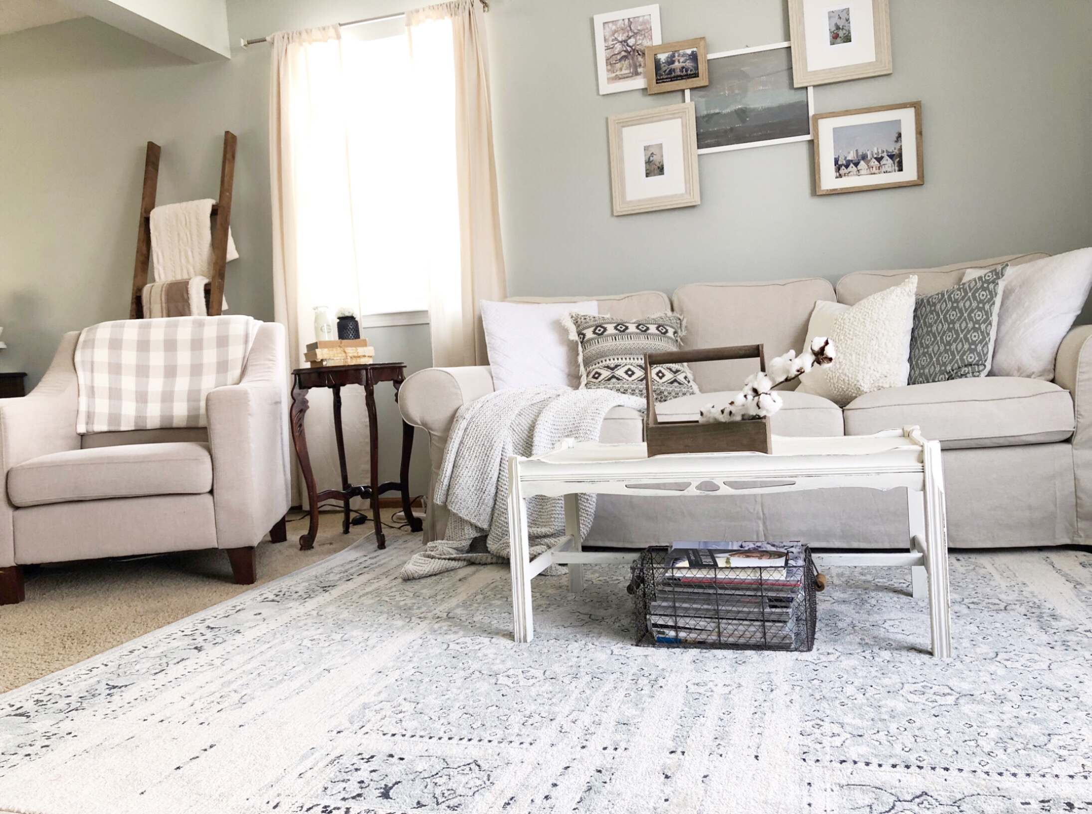
I wanted to go with a relaxing vibe, with soft neutrals and blues. For winter, I also incorporated texture, instead of a lot of color. I wanted the room to feel comfortable and calming. Here is our living room now!

I love the way it turned out! This rug was one of my picks from this post, and I couldn't be happier with it! It's the perfect combination of blues, grays, and creams. It's really soft, too! It's not a super high pile, so it's not too plush, but it's so soft under our feet. 

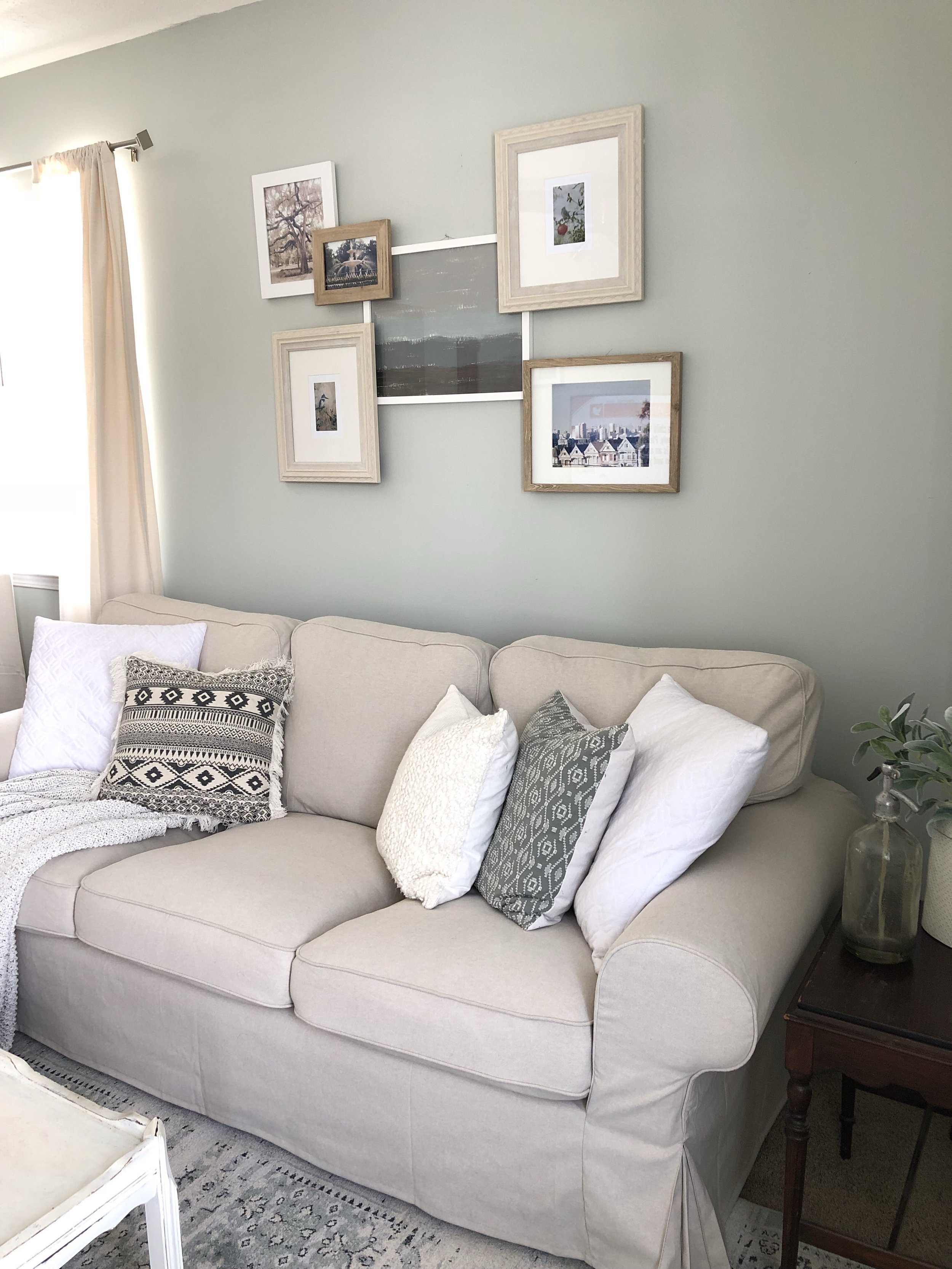
As for our Ikea sofa, we still love it! I talked about my first impressions of it here. We still love the look and feel of it. It's perfect for our living room. 

For the wall behind the couch, I had a few things in mind, but I'm so happy I went with this layered gallery wall. It was easy and relatively inexpensive. Three of the photos are ones we took in California when we lived there, and then in Savannah when we went there on vacation. I love that the photos mean something to us. The middle picture was a DIY I did and I love the way it turned out. It was also really easy and inexpensive. 

I'm so happy with the way this room turned out. I love light and bright spaces, and this is definitely that. I'm looking forward to adding pops of color in the coming seasons. 

I hope you enjoyed seeing our living room makeover! If you have any questions about anything in the pictures let me know! I'd be happy to answer any!

Thanks for reading!
 

Bathroom Reveal

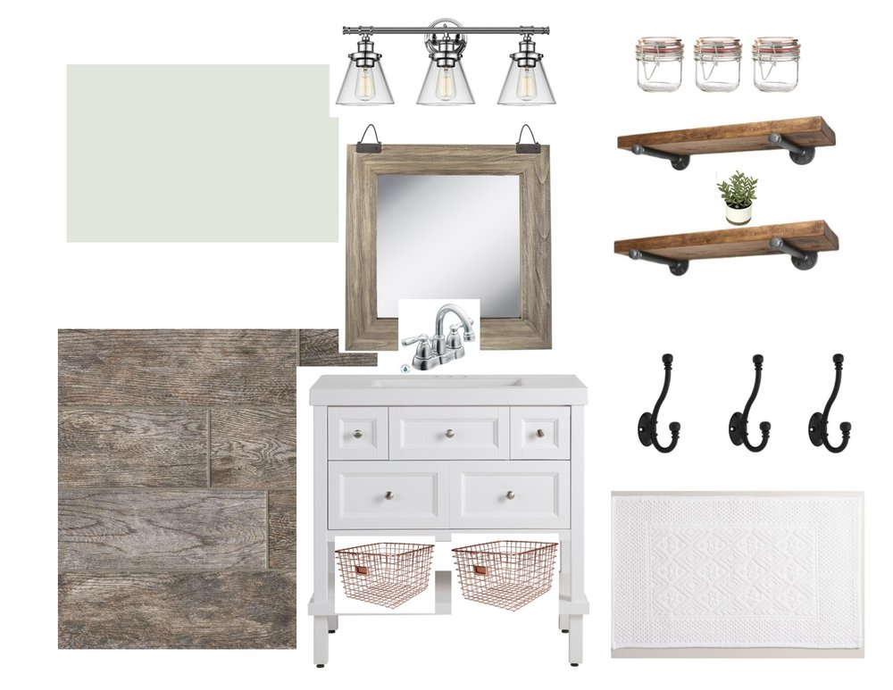
It's time to finally reveal our full bath remodel! I'm so excited to share the final product with you all. We worked so hard on it, when I say we I mean my husband, and I love the way it turned out! Here is the storyboard I created for the full bath. 

Bathroom Storyboard

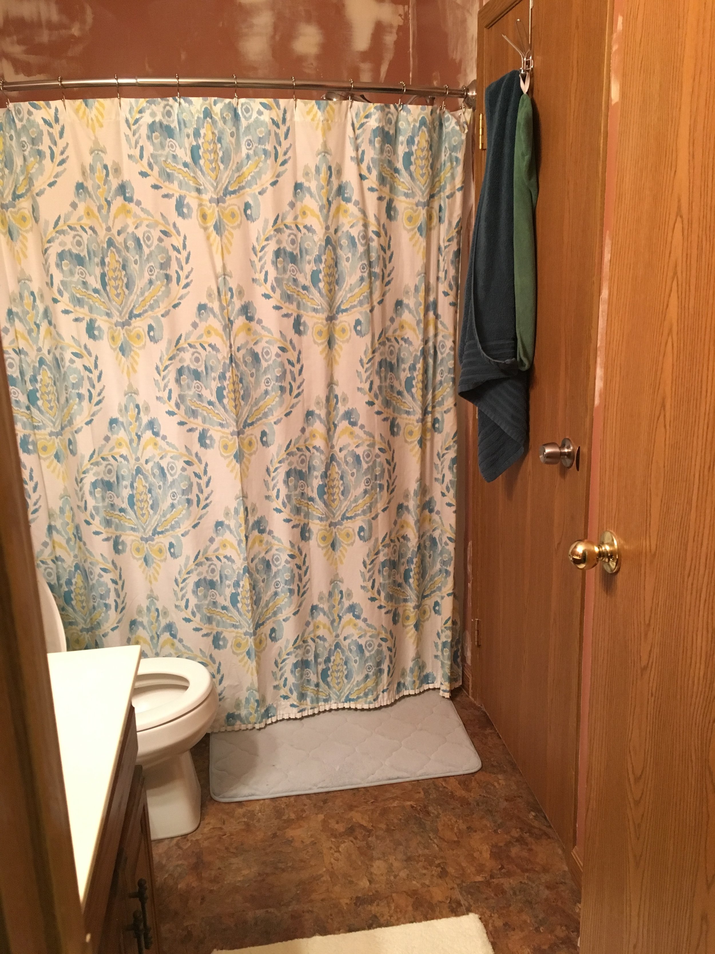
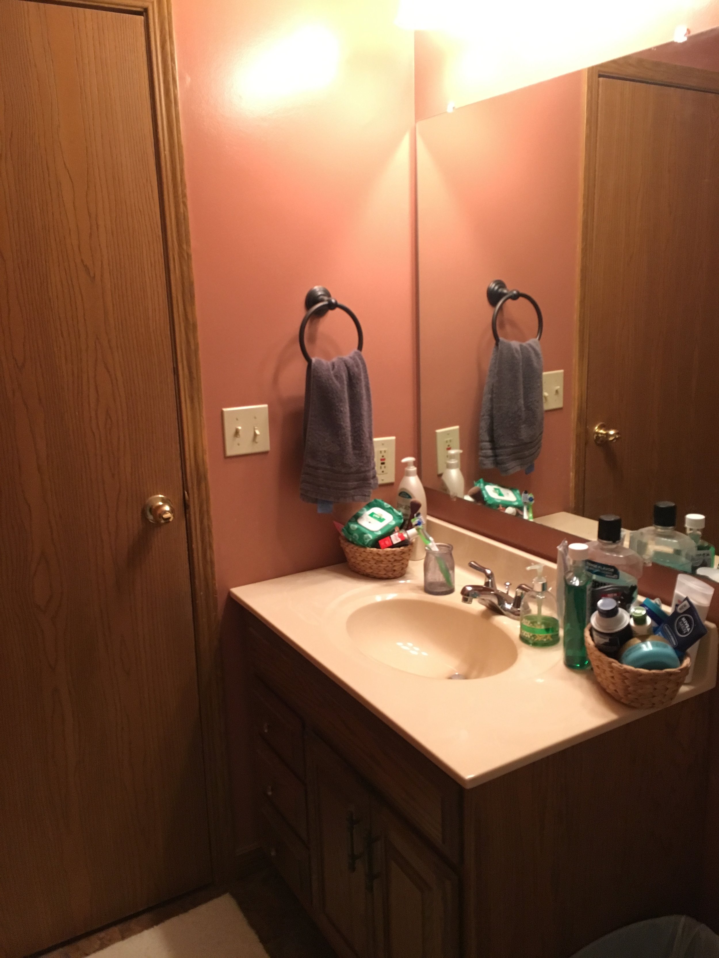
Here's a refresh on what the bathroom looked like before. 

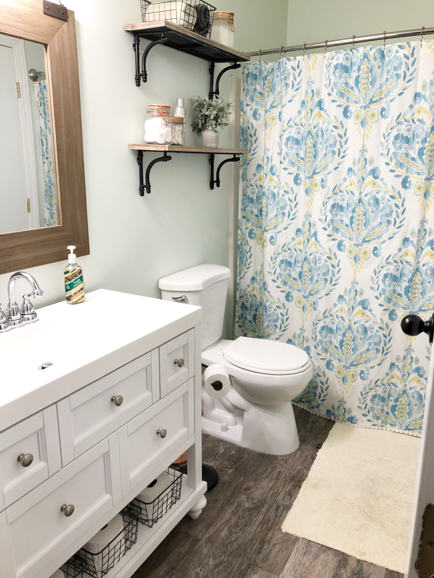
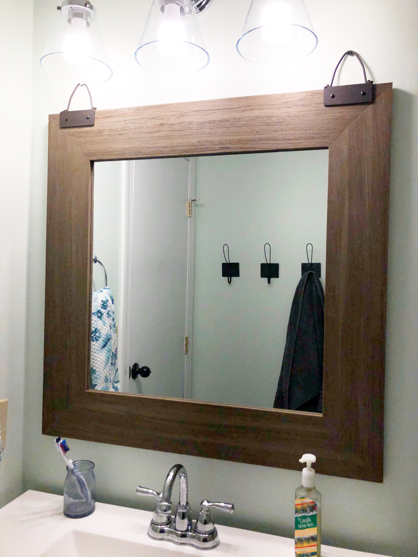
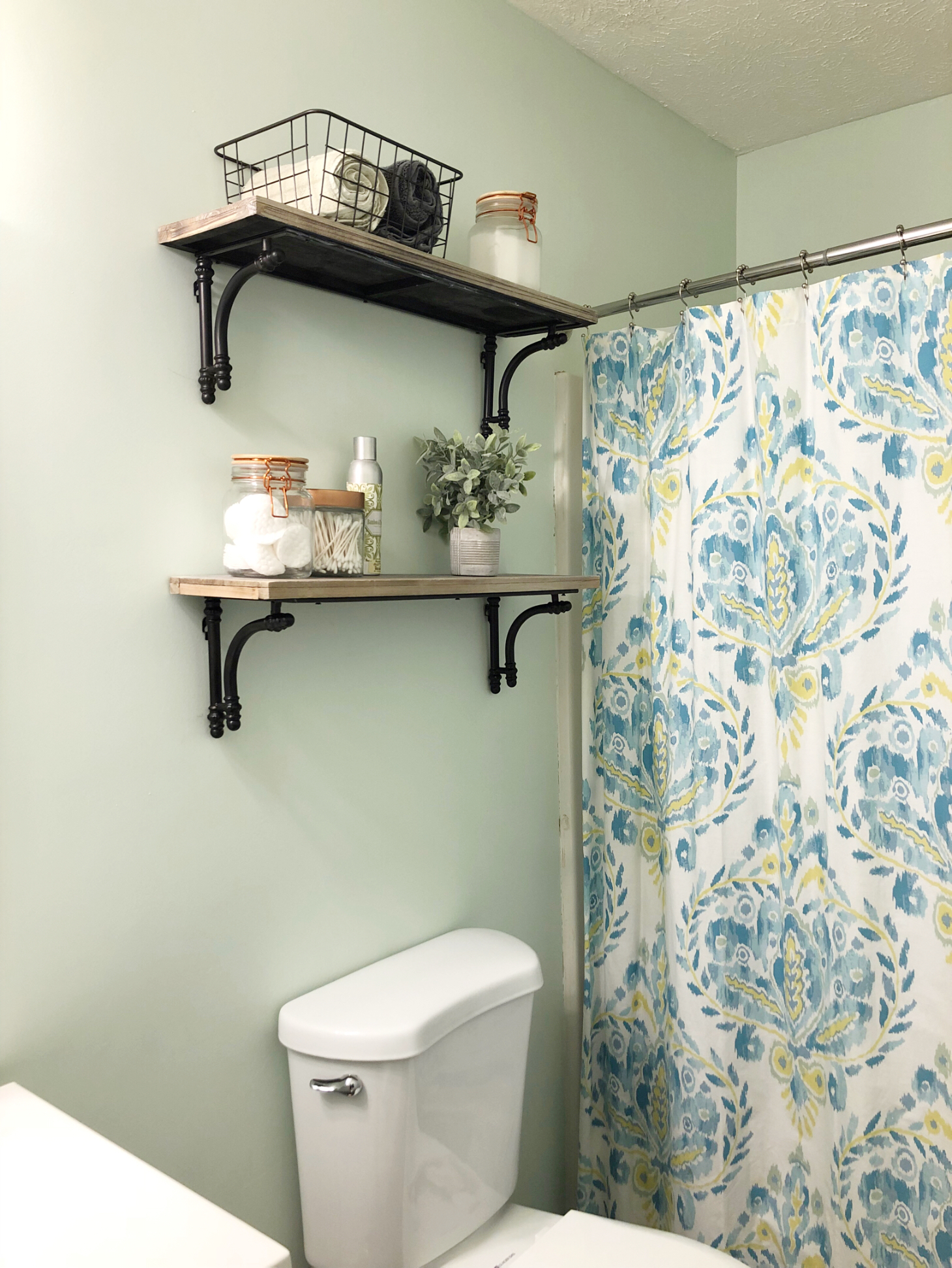
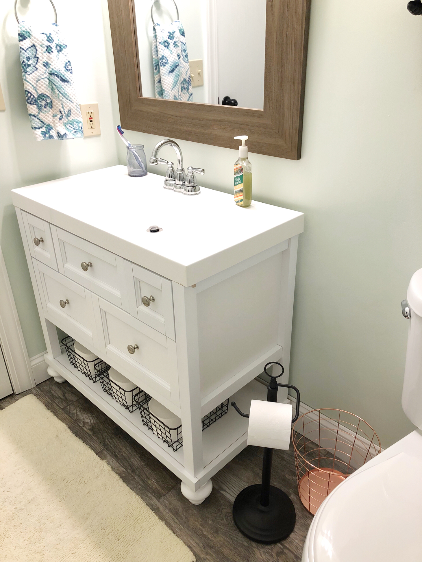
And here is the bathroom now!

I absolutely love the way it turned out! It is exactly what I had in my mind. 

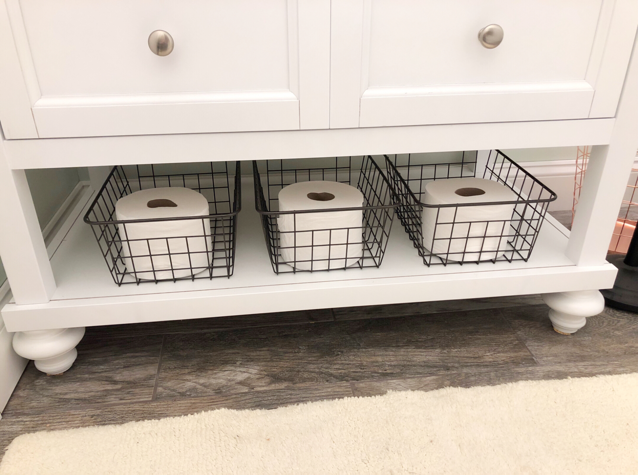
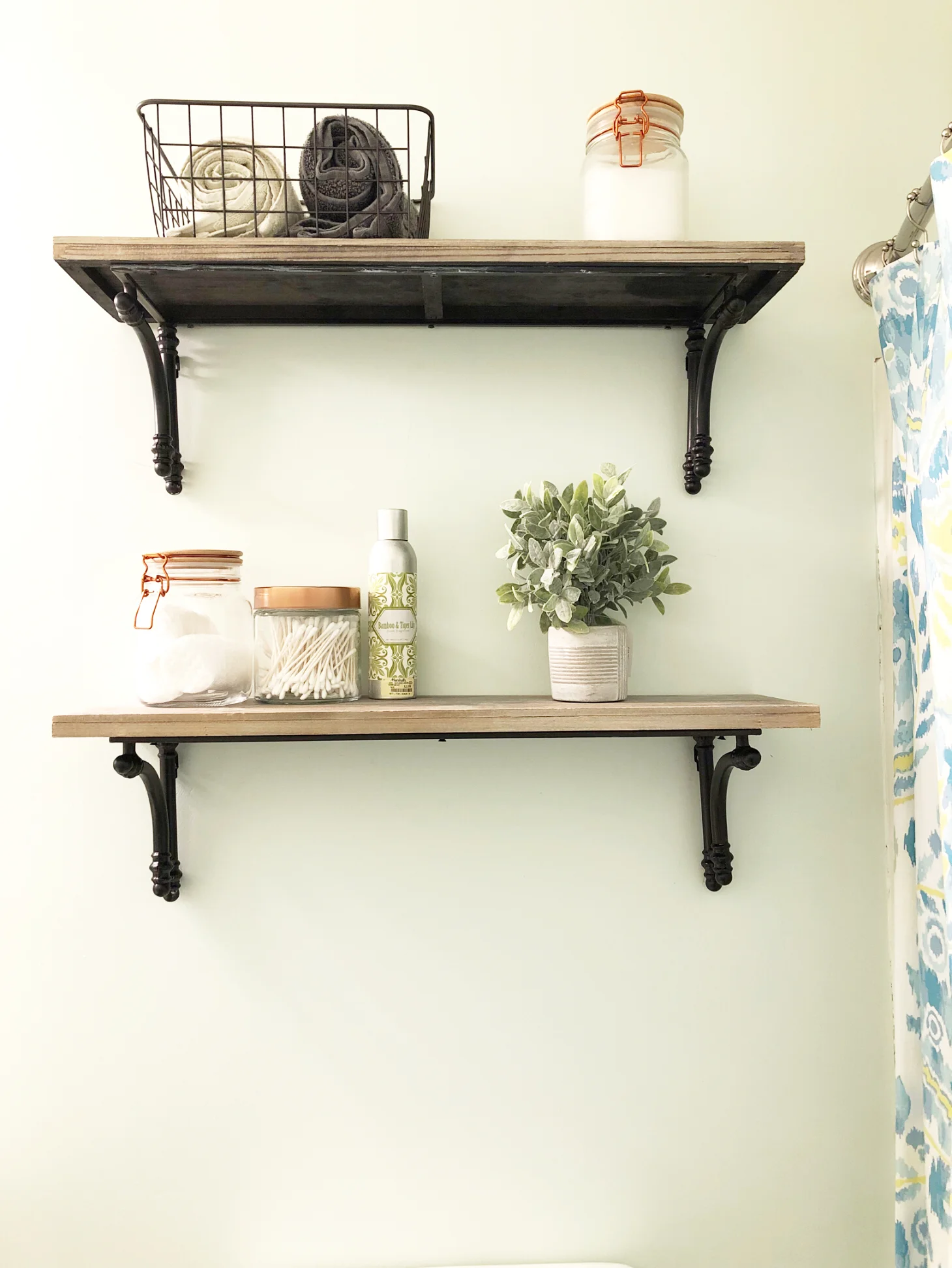
I really wanted to incorporate some copper, since it's so popular right now, and I thought this was the perfect space to add some touches of it. It's not overwhelmingly copper, but I used some glass canisters with copper accents, and a copper trash can. I also wanted to add in some black accents. As you can see from the rest of my home I love black accents. I used black wire baskets under the vanity and on one of the shelves, which also have some black accents, a black toilet paper holder, and some black hooks. I think the black really pops against the light walls. 

We had to add new vanity feet because the ones that came with it didn't feel very sturdy and it made the vanity too tall. So, we got these vanity legs from Home Depot and painted them white to match the vanity. 

Speaking of the vanity, man this thing caused some problems. As I just mentioned, the vanity legs were not sturdy at all and actually broke a little bit while we were trying to stand it up. It was also really tall. We aren't super tall people and the space isn't very big so the tall vanity seemed out of place in our bathroom. Also, the vanity top doesn't sit completely on the vanity. It pretty much sits on only the corners. We used an adhesive to attached it so it's secure, but I would prefer it to be touching all four sides of the vanity top. Overall I love the way the vanity looks. It was a good price, and I think it shows in the quality of it. But it does work and looks great in the space. 

I am so happy with the way the bathroom turned out! John did such a great job with everything! He is so awesome with executing all of my design dreams and making them look better than I imagined. 

I hope you enjoyed seeing the before and after pictures of this bathroom remodel. Let me know what you think of the end result in the comments!

Thanks for reading! 
 

Sources:

Vanity

Mirror

Light

Floor

Shelves

Hooks

Toilet paper holder (Similar)

Faucet


Bathroom Update

Happy 2018! I can't believe it's already the new year! I have so much planned for the year, new projects, more home decor inspiration, lifestyle and fashion, a little bit of everything! 

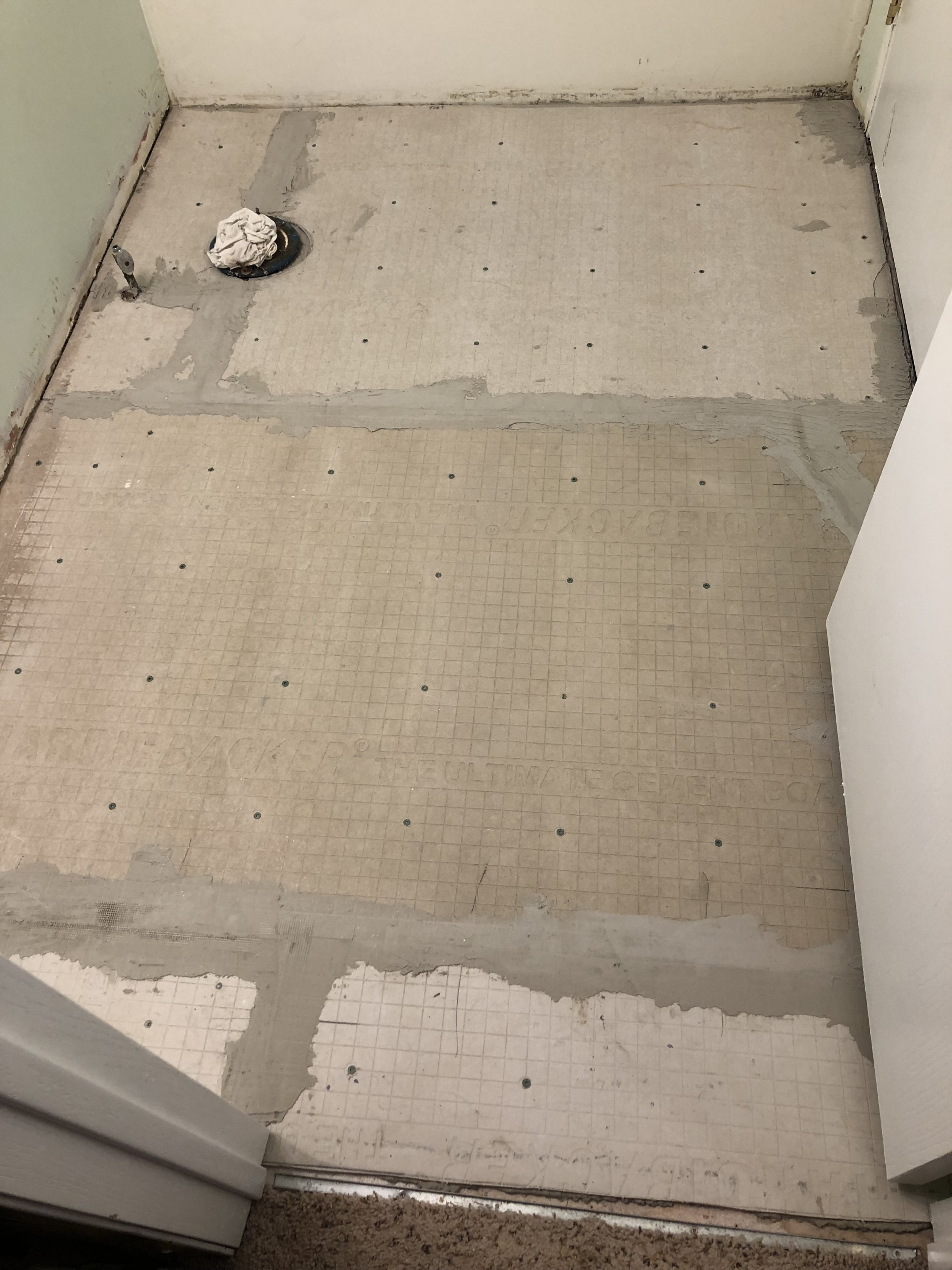
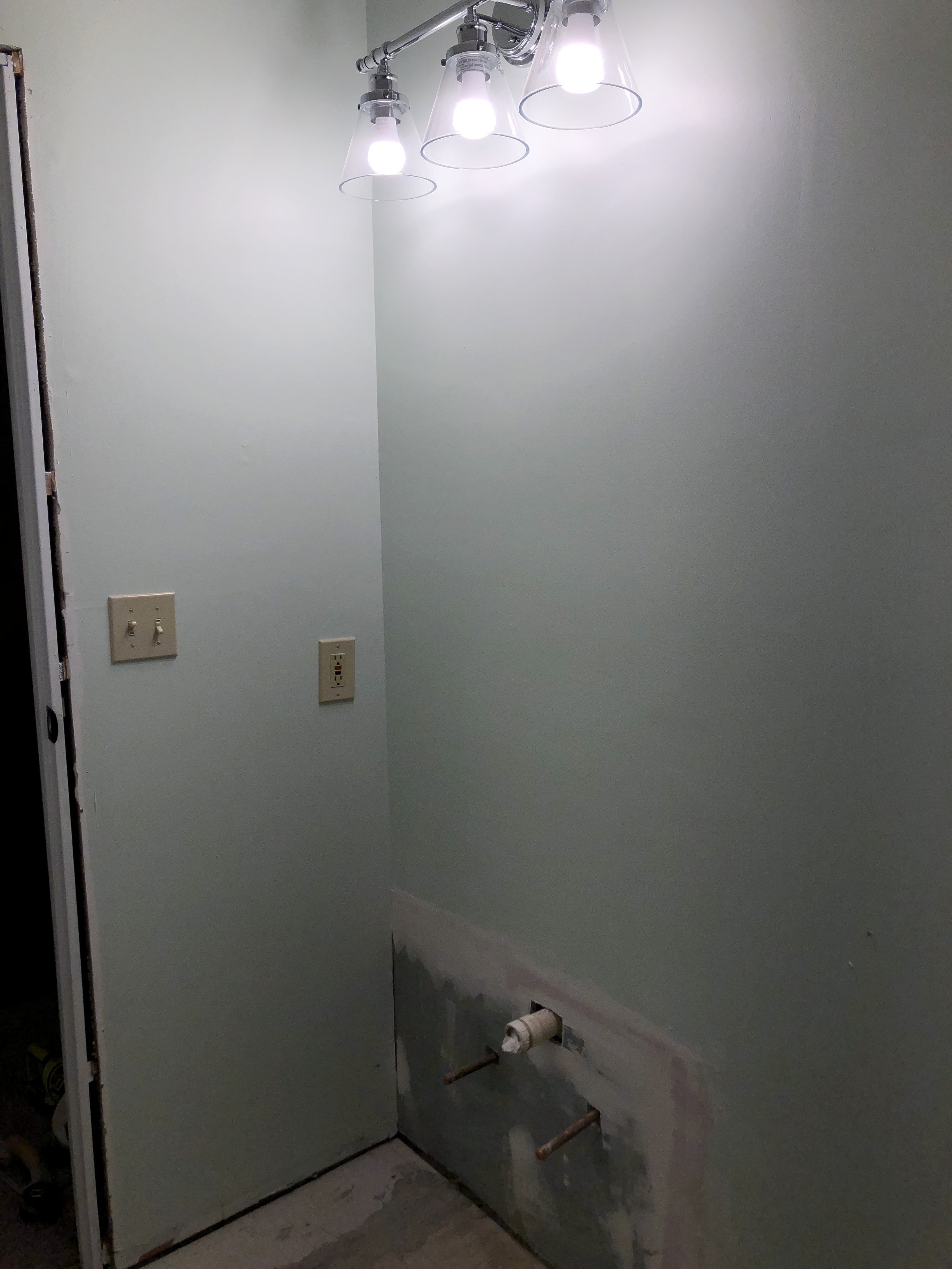
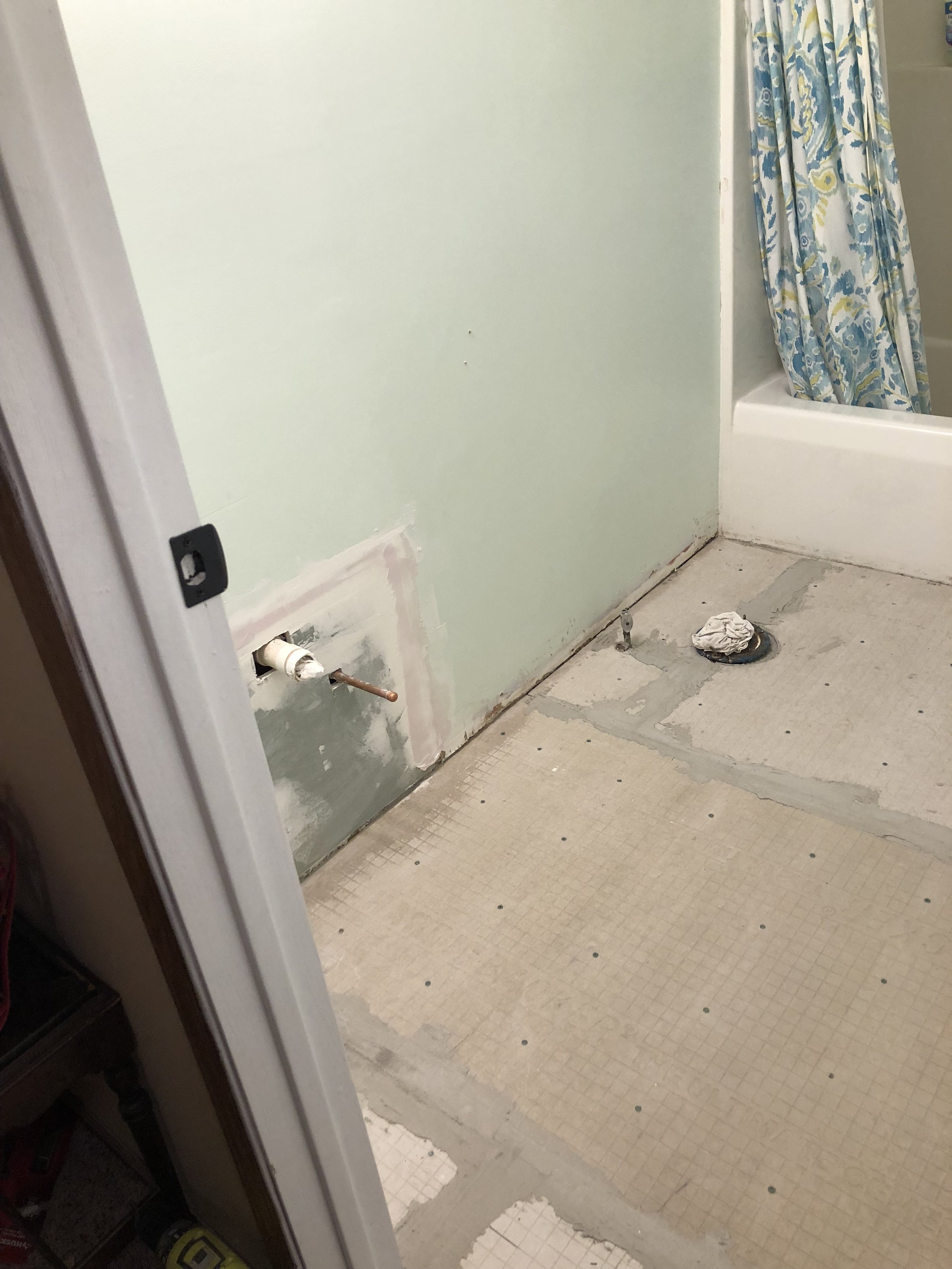
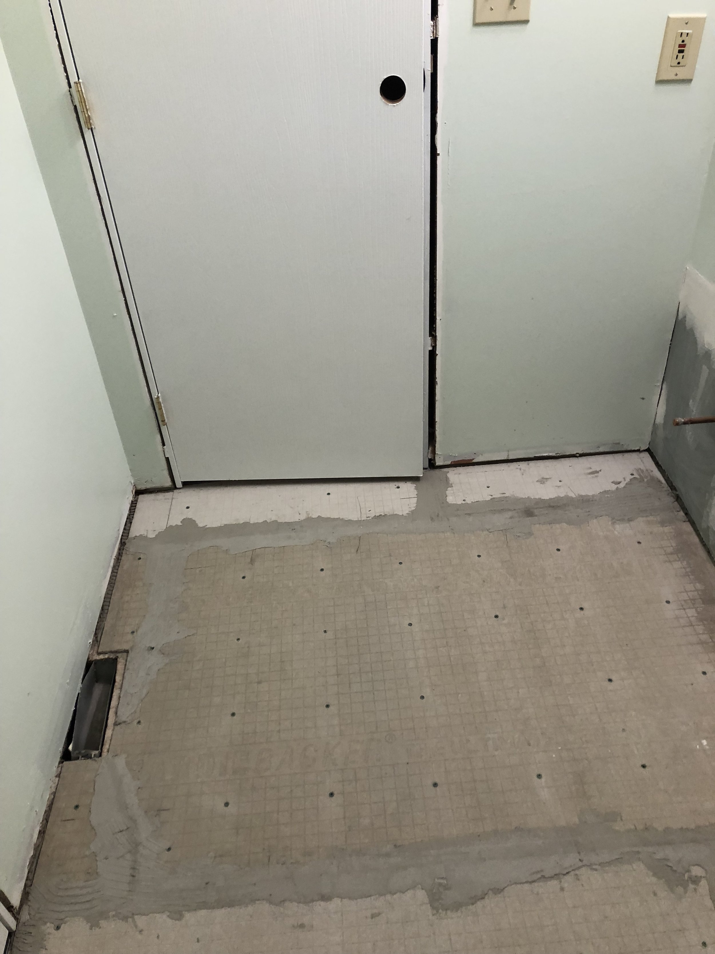
So with that said, I want to do an update on our bathroom remodel. It's not finished but I wanted to share some progress photos.

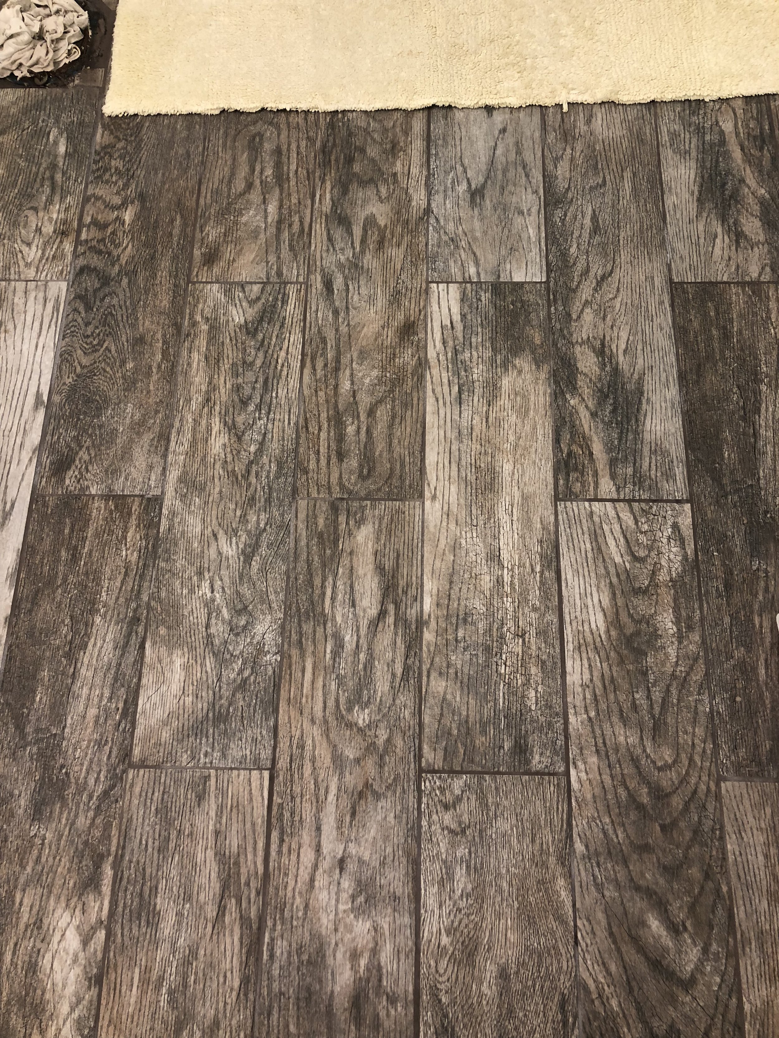
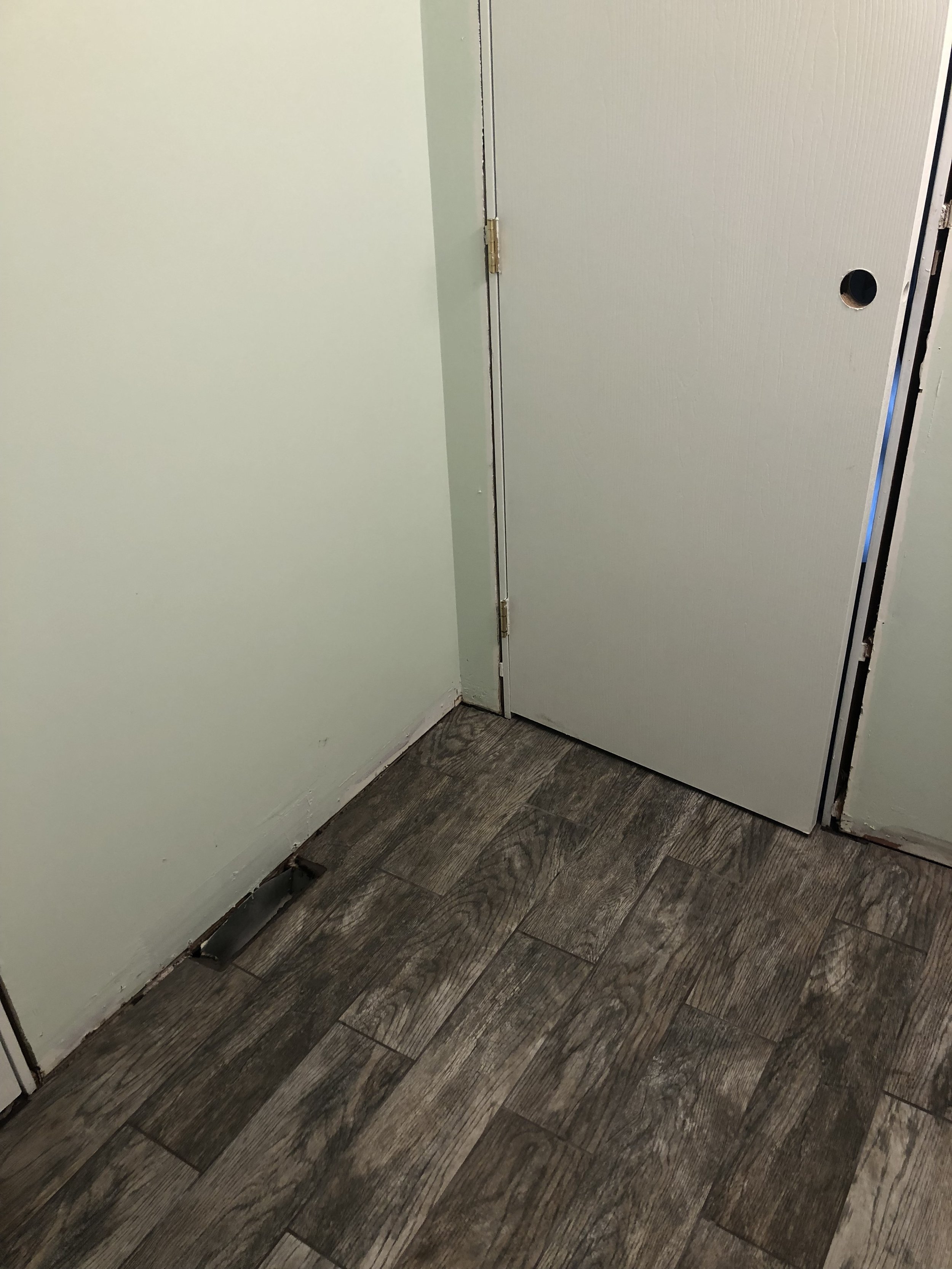
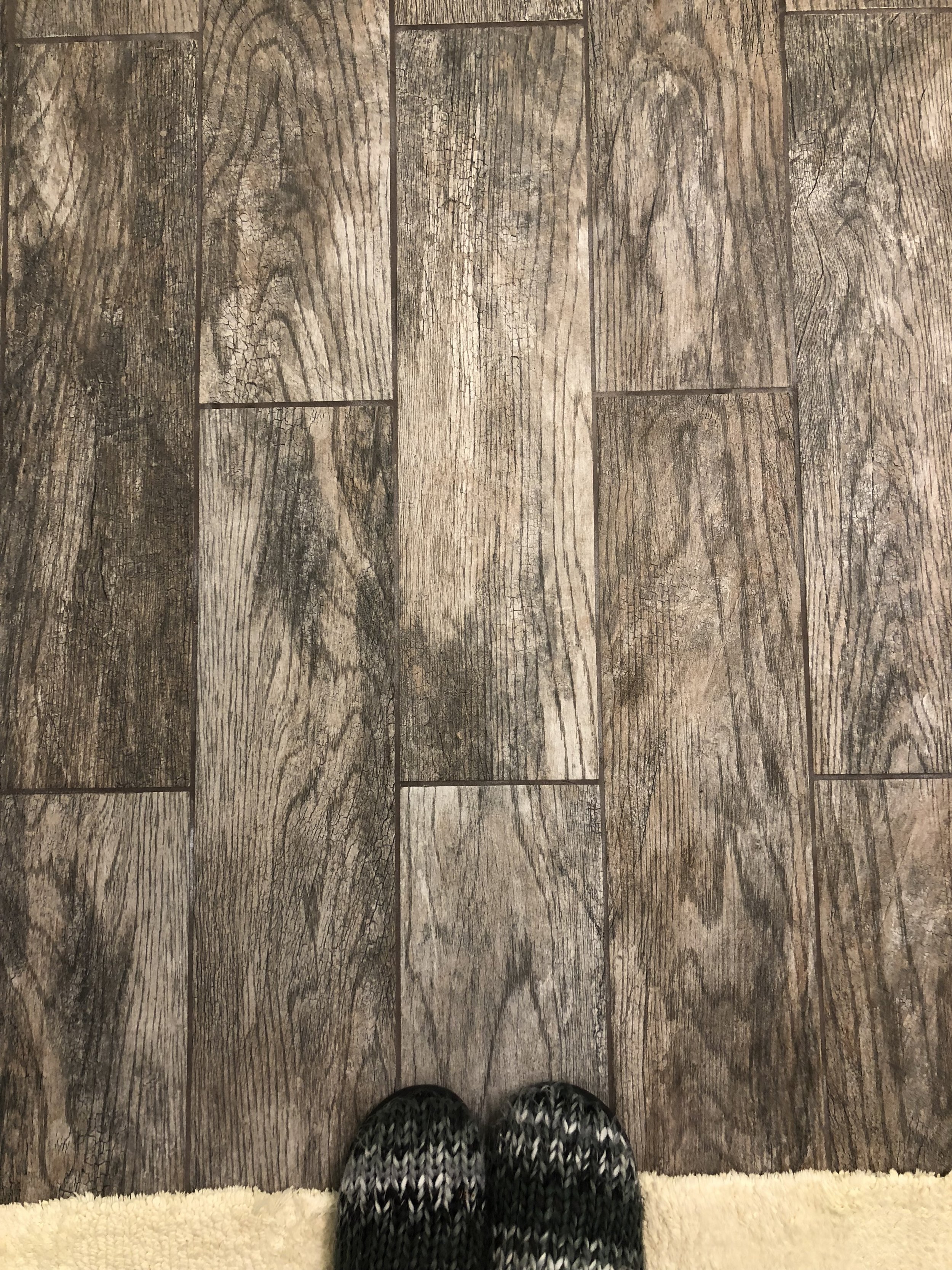
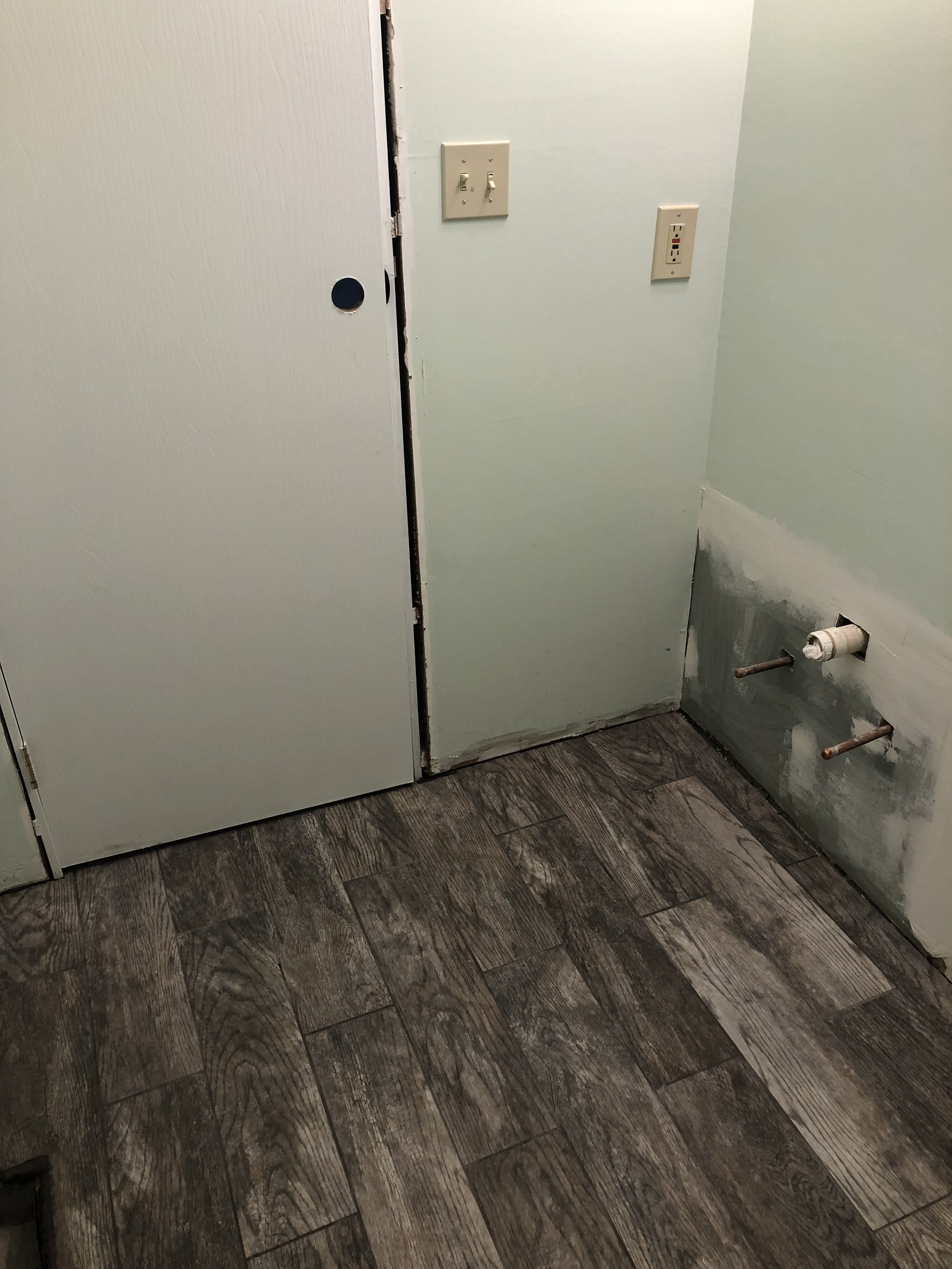
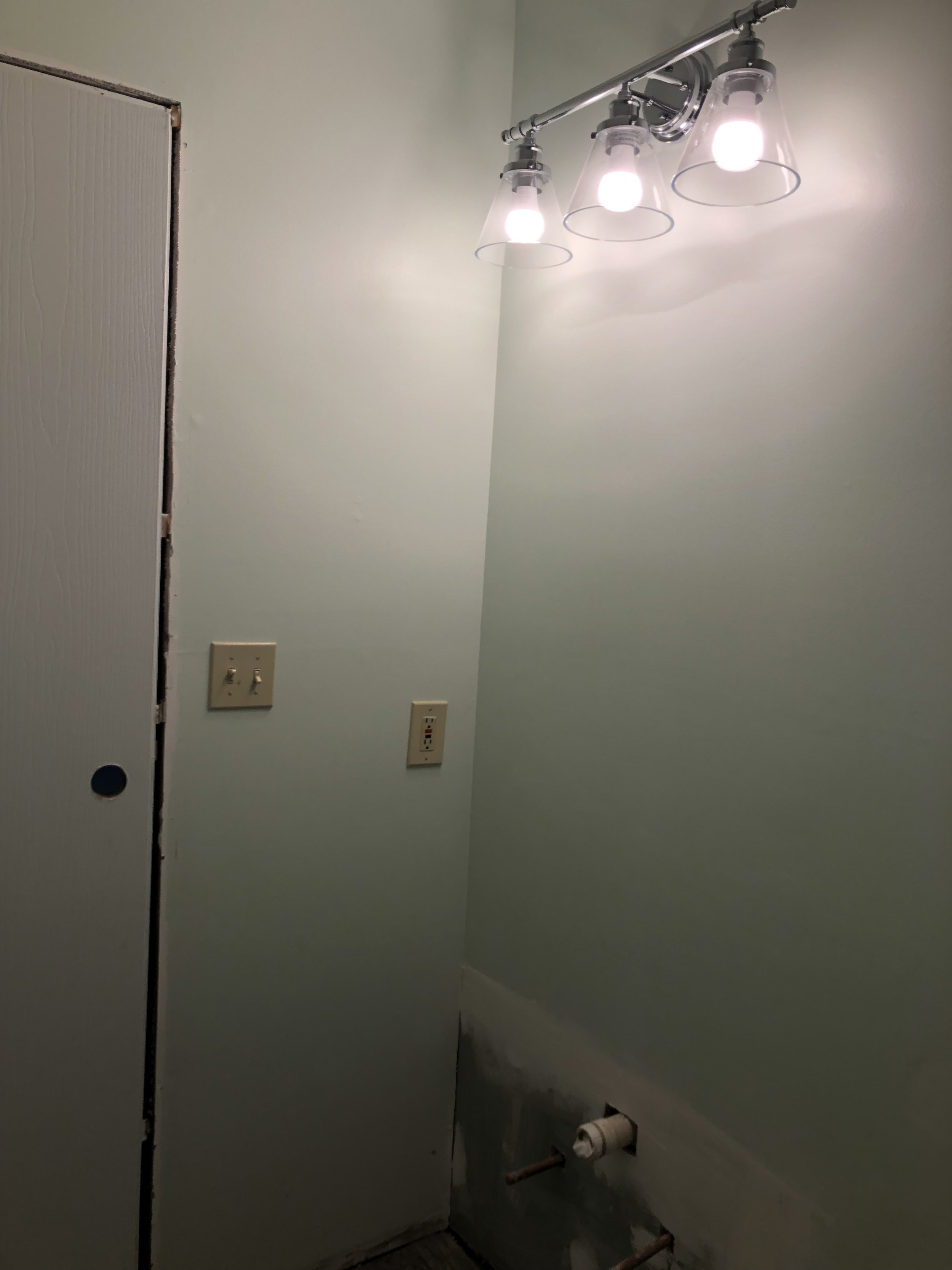
We've painted the walls and the doors, ripped everything out, including the old floors, relocated the vanity pipes to the wall, and tiled the floors. And, when I say "we" I really mean my husband. He has been awesome with all of my remodel ideas. I helped paint, but other than that it's been all him! Here's some pictures of the progress!


Our next steps would be adding the new trim, installing the new toilet and vanity, caulking around the tub, putting the door knobs back on, and adding the hooks to the wall behind the door. After that it's time to start decorating! We will be adding some shelves behind the toilet which I'm excited to style. I still have to pick out and purchase a mirror, so that's my mission. The one from my storyboard is no longer available at my Hobby Lobby and I'd rather not pay for the shipping to order it online. I still need to purchase the rugs and a toilet paper holders and then I think we will have everything we need for it. I love the way it's turning out!

I can't wait to share the after photos! 

Thanks for reading!
 

If you enjoyed this post, you should check out A Modern Farmhouse Bathroom-StoryboardBathroom Storyboard, and Bathroom Reveal 

A Modern Farmhouse Bathroom - Storyboard

I mentioned before that we are going to be redoing our upstairs bathroom and now it's that time! On Friday we will be quoting Chip Gaines, "It's demo day!" I'm so excited to see the end result! 

This is how our bathroom looks right now. My husband started patching and sanding so that's what the white spots are on the walls. The walls are this pink/red/brown color that makes the room feel smaller than it is. The floor is a vinyl that is made to look like a stone with browns and tans. The vanity is probably the original with a brown vanity base and a light vanity top. 

I can't wait to bring in some lighter colors and update this space to our modern farmhouse style!

Bathroom Before
Bathroom Before
Bathroom Before
Bathroom Before

Just like I do for my clients, I like to make a storyboard before we do a project. It helps me see what the space will look like and I can see the different products next to each other. Here is the storyboard I made for our full bathroom. 

Bathroom Storyboard

We're painting the walls a lighter green/gray color and replacing the outdated floor with some wood look tile in a light brown.

We got a new vanity that's white with a white top. The bottom is open which will help make the room not feel so small. We chose to go with the same faucet we have in our downstairs bathroom. I love the simple classic look of it.

Instead of a towel bar, I want to use hooks to tie in the farmhouse style. I chose black to contrast all the light colors I have in here.

The light fixture is modern farmhouse and simple. I love it.

I have some wood and black shelves I'm going to put behind the toilet for extra storage. I got some glass and copper canisters from the Target dollar spot I'm going to use along with some copper wire baskets for even more storage.

For the rugs, I want to stay light and bright with some simple white bath mats.

I really wanted to tie in some rustic charm with the mirror. I'm not sure if we're going with this exact mirror, but we want the same look. 

We're keeping our shower curtain because I love it so much! The colors tie in so nicely with the new design. I picked the wall color with this shower curtain in mind. 

My overall feel for this bathroom is modern farmhouse, which is basically our entire house. I love the mix of farmhouse style with some modern elements. 

I hope you enjoyed seeing my vision for our bathroom. I will share the after photos when it's done! 

Thanks for reading! 

If you enjoyed this post you should check out Bathroom StoryboardFarmhouse Floor Tile, What is E-Design, and Why E-Design 

A Christmas Dining Room

I'm going to be posting a Christmas home tour soon, but I wanted to share my dining room with you now. I'm sticking to pretty traditional colors this year with the greens and reds and I love the added black accents. I wanted to incorporate texture and keep it pretty simple. I hope this gives you some inspiration for your own dining room! 

Christmas Dining Room

I mixed a few different garlands for the table and added some cotton for a natural feel. The candle holder is from Target and I love it. The candles never seem to stay straight but it just makes it unique :)

The Farmhouse Christmas sign is from TJMaxx and I made the four Christmas saying signs. I also made the hoop wreath that's in the middle of them. I will do a tutorial for those if anyone is interested.

The Fresh Cut Christmas Trees sign is from the Target dollar spot and it's perfect on my blanket ladder. 

I hope you enjoyed seeing a glimpse into our Christmas home! I will be doing a home tour soon! 

Thanks for reading!